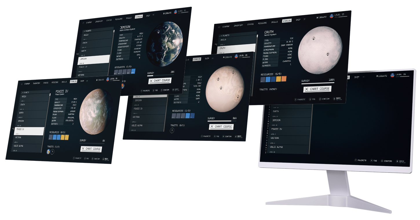
explore the stars without worry
in starfield
Creating a new accessible, cognitive-friendly journey log feature in Bethesda's latest IP that captures the beauty of their pre-existing design language.
| Role | Timeline | Class | Skills | Tools |
|---|---|---|---|---|
| Designer | Aug - Dec 2023 | User Interface Design II | Interaction Design Visual Design Prototyping |
Figma Photoshop |
Project Overview
For my User Interface Design II class, I was challenged with implementing the principles of UX design psychology into a project of our choice. The duration of the semester was spent iteratively developing the application based on course study and feedback from our peers.
I chose to develop a journey log for the video game Starfield. I wanted to create a more accessible interface that allows players to easily track and recall the planets and resources they've come across - a feature that is not currently found in the game.
The Problem
Early on in the semester, we were tasked with a proejct that involved redesigning a user interface of our choice. It was our job to employ user-centered thinking to explore the many psychological principles of design and how they can potentially improve user interfaces. For my assignment, I chose to examine and redesign the inventory menu.
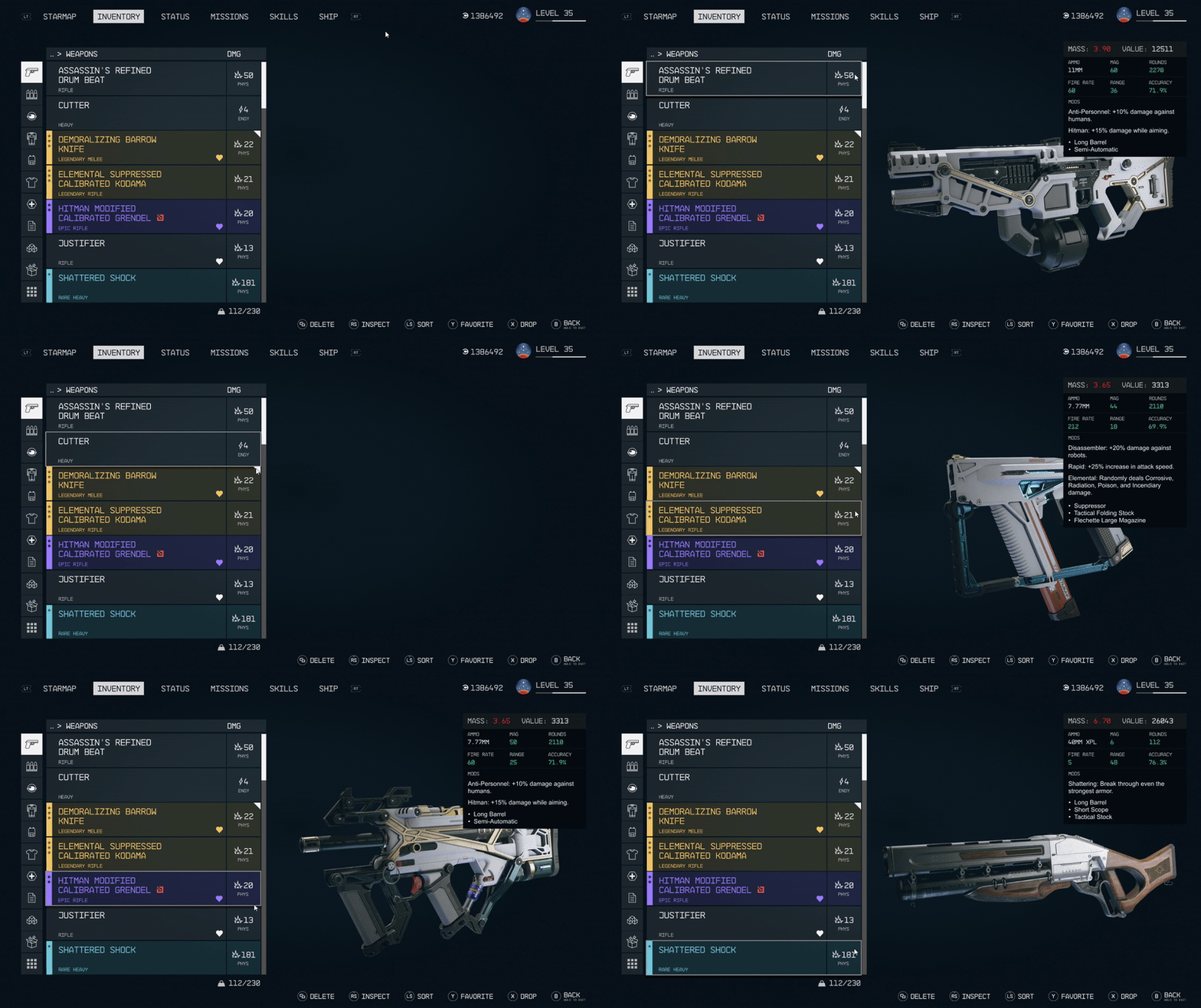
During this project I decided I wanted to continue my work on Starfield. I had taken a great interest in the game from both a design and player perspective and wanted to help solve a fairly sizeable problem that I knew players were facing.
It was clear that in a game of nearly 2000 planets, players wanted a system in-game that allowed them to track their discoveries, whether that be planets, resources, flora and fauna, etc. The absence of this type of feature seemingly increased the cognitive load of players, leaving many feeling angry and alienated. Players wanted the freedom of exploration with the knowledge and security of knowing they could easily log and track their journey along the way.
I started my project with a few user goals in mind:
- Track discovered star systems
- Log resources found and resources per planet (flora, fauna, ore, etc)
- Show planetary traits and locations
- Track player outposts per planet
- Allow users to search for planets and resources at will
Finding an Audience
While this project didn't require a traditional UX process involving thorough user research and interviews, I tried to ground my ideas in the needs and wants of the Starfield community.
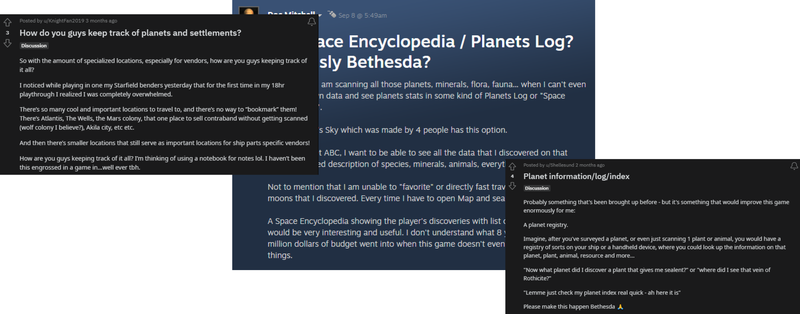
Personal discussion with friends, Reddit threads, and Steam forum discussions allowed me to gain a deeper insight into the communities desires. While many of their wants seemed contentious, the idea of an exploration log was one that pop up time and time again.
During this time, I came across a physical captain's log for the game, and my ideas really began to take shape.
Unfortunately, the physical log comes with quite a few limitations. Having to spend extra money on supplementary tools when users have spent $70 on a game doesn't feel great, and the 100-page limitation on logging means that players can easily fill 10-20 of these logs given their propensity for exploration.
Being an avid fan and player myself, I felt intimately familiar with this problem, and knew an elegant solution could be proposed that gave players comfortable agency in their exploration while maintaining the game's established design language.
Breaking Down a Design Language
Starfield, of course, has an incredibly beautiful and established design language that is both informative and minimal. Taking hints from established aesthetics like cassette futurism, and beloved media including Prospect, Cowboy Bebop, and Event Horizon, Starfield brings it all together to create a distinct vintage-adjacent experience in modern space.


NB Architekt™ is, in my opinion, such an understated addition to Starfield. It does well to capture the feel of a retro futuristic aesthetic in that it lends itself to making the language of the game feel like its part of the universe's advanced technology, but emanates a sense of grounded, old-world simplicity.
The biggest challenge in replicating Starfield's design language was their complex iconography. During this project's ideation phase, recreating all the necessary icons felt like a truly daunting task, but once again, I was in luck. Thanks to Bethesda's established history of encouraging the modding community, I was able to exact much of the iconography directly from the game's files using few choice programs -- just as a modder would.
This exploration me an in-depth look at the vectors used in the game, allowing me to more easily replicate and make new icons for anything I couldn't find in the same style. It was a fun challenge and allowed me to gain some interesting perspective on both game development and the hobby of modding.
With the font and iconography nailed down, the rest was easy. Hundreds of hours in the game prior to this project allowed a distinct sense of familiarity with the established aesthetic, and all that was left to do was to start with the basics: lines and rectangles.
Ideation
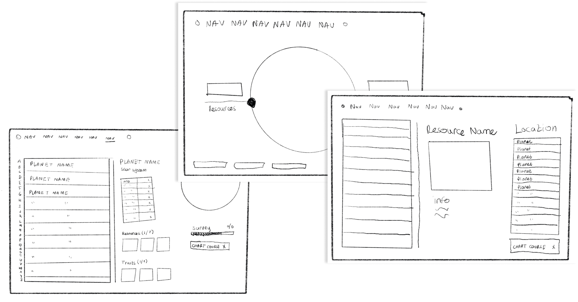
After finding comfort with the aesthetic, I was able to quickly flesh out some ideas for the log itself. Taking hints from both the in-game UI and physical logbook, the first round of sketches tried to encompass the more important idea: what planet am I looking at, what does it have, and how can I most easily return?
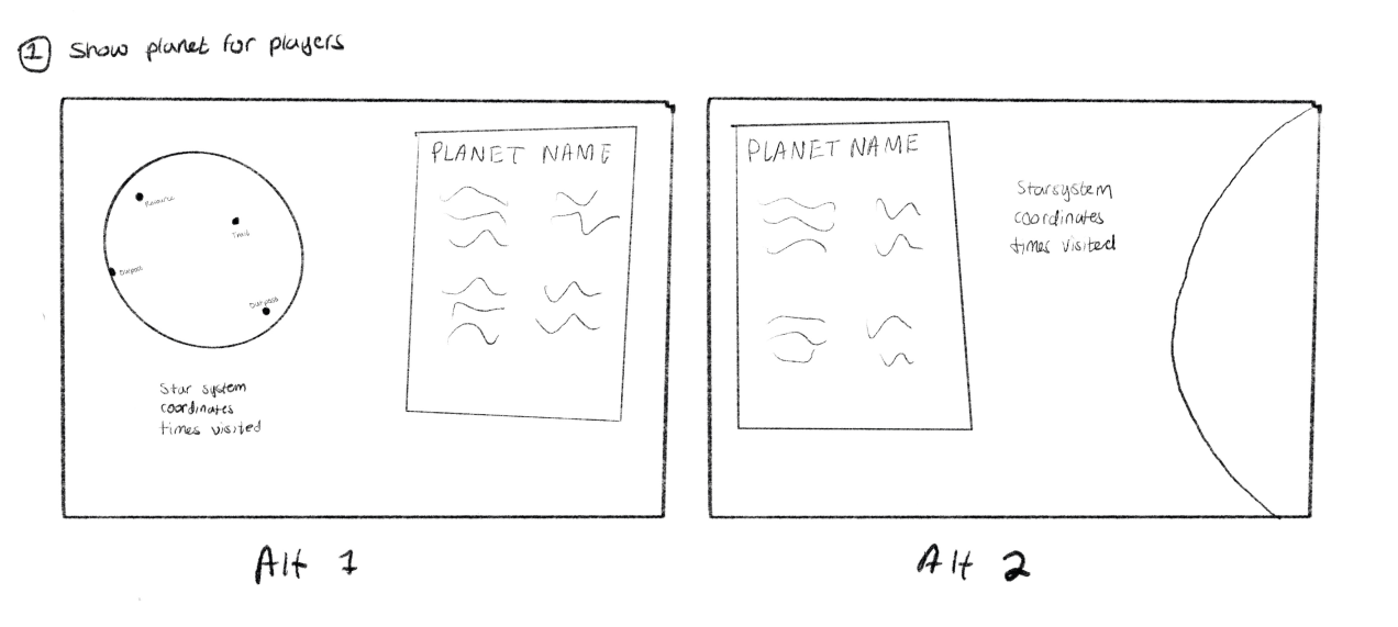
It wasn't until my second, more realized iteration of sketches did I find the real essence of the interface I was searching for. With the help of my previous UI rework, I came to understand the journey log as simply an extension of the interface I was already intimately familiar with. Thanks to my previous efforts, the bones were all there for me.
The Solution
The final iteration of the prototype saw the journey log divided into two parts: resources and planets. I wanted an initial menu that was simple, clean, and didn't leave any room for mistakes. With this design, I was confident that no matter what choice the player made in the moment, it would lead them to a flow that felt familiar and easy to navigate.
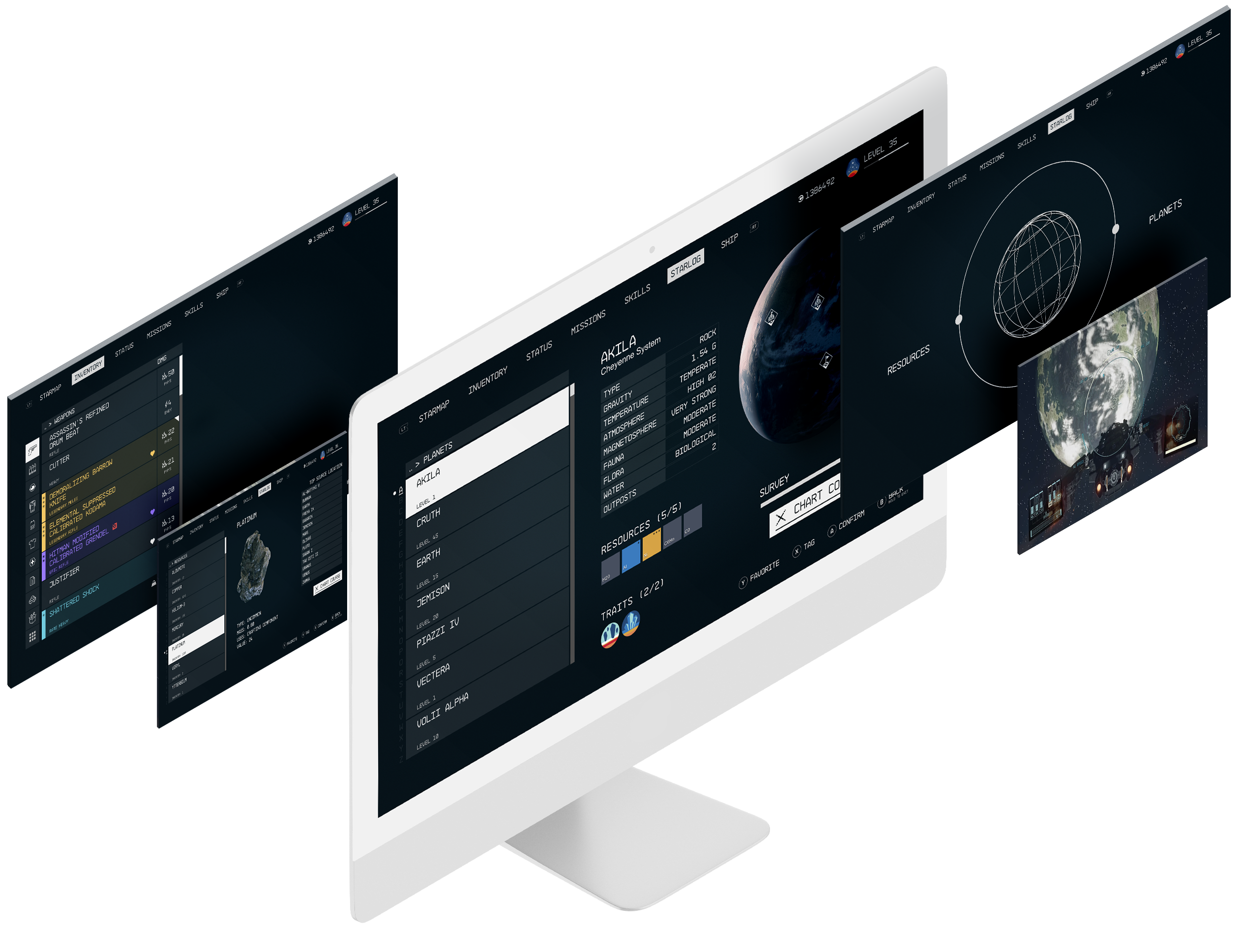
This project focuses a lot on lessening the cognitive load of players—particularly intrinsic and extraneous—by allowing them to not have to rely as hard on their working memory. I wanted the broader, casual audience to have something accessible and approachable to use during their adventures.
Chunking and Miller's Law became important, as there was a lot of information that needs to be automatically logged for the players to revisit. Immediate memory and judgement is aided by chunks, allowing players to process the information as a group, as stated by the Law of Proximity.
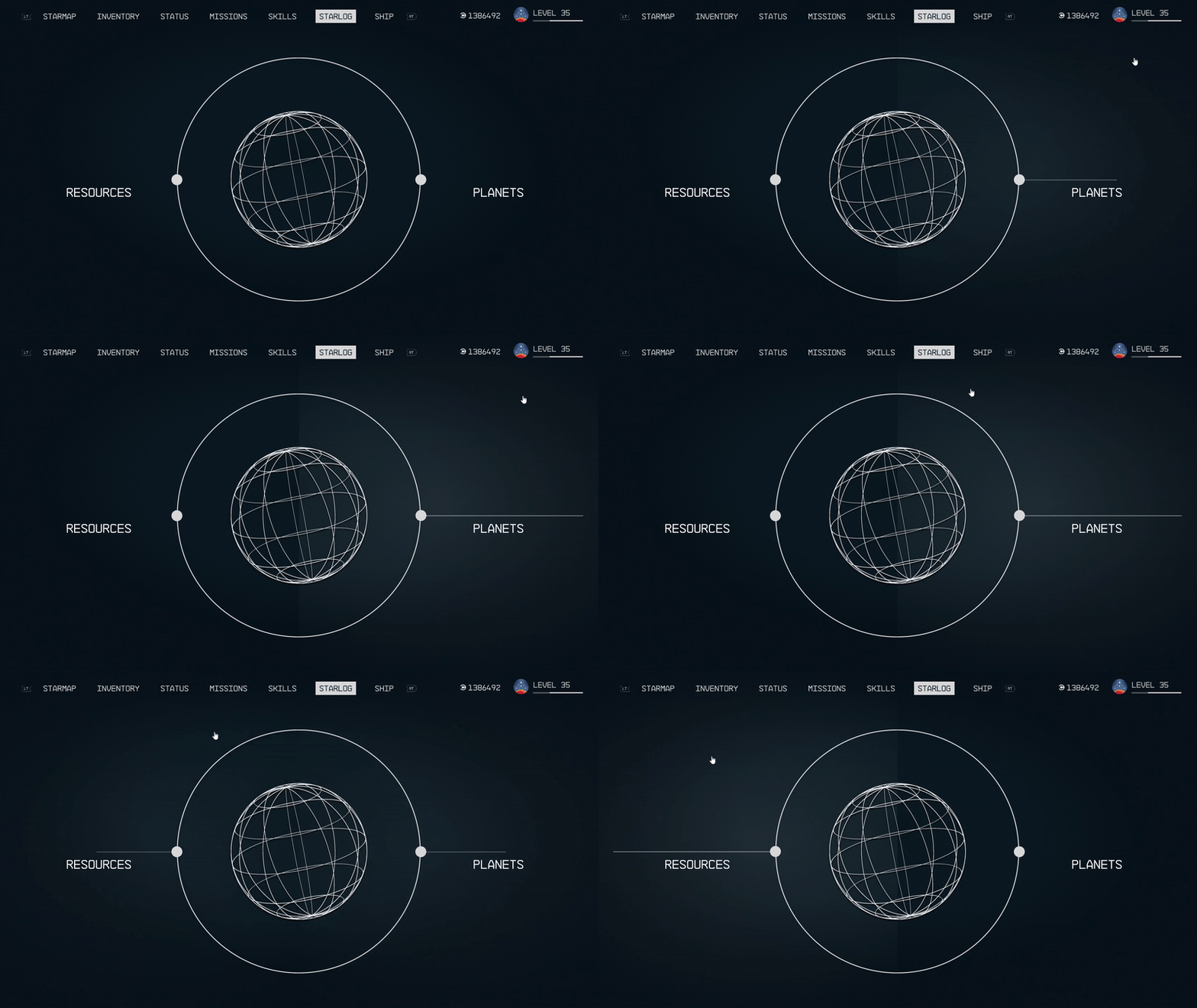
In order to aid the overall use of this system, Jakob's Law and the prior knowledge that comes with it will play a role. A log/encyclopedia style system that tracks players' findings isn't anything new. Plenty of games take the stress off the player and give them a log of the things they've discovered, and I've taken hints from them. Players tend to react better and are comforted by familiar systems and recognizable schemas. I wanted to create a framework they know they can navigate and explore without having to learn too many new things.
Whether the player choose resources or planets, they will be guided to a familiar page where they can easily scroll through the provided information. I wanted to make things clear and minimal all while injecting only the most vital information to aid in the natural flow of gameplay. Alongside that, the experience was designed with the ease of controller players in mind. Larger touch zones, easy presses, and font sizes and choices that would be experienced well from the couch.
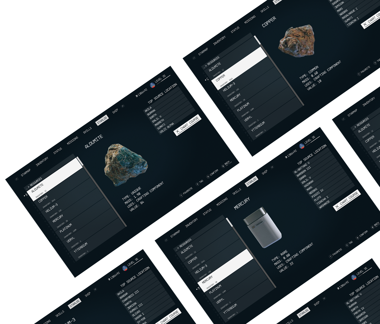
For resources, it was most important that the player understand what it looks like, the type of resource it is, its weight and value, and the top locations where they can find it. Players can then actively select a planet they want to travel to, press “chart course”, and be well on their way with little to no hassle.
I opted for “top source location” because of the size of the game. It was simply impossible for this project to include every single location a resource was available.

The planets section works similarly. All the necessary planetary information is provided—temperature, gravity, flora, fauna, etc. Players are also able to see resources on the specific planet, as well as its unique traits. Because players are able to survey the planet when they are on the ground, I've provided a progress bar. This allows players to easily keep track of their planetary completion without having to travel to the planet itself.
The goal here was to employ the use of the Zeigarnik Effect to provide a clear indication of progress in order to motivate them to complete their tasks, “unlock” their planet, and continue to fill out their journey log in an enriched, natural way.
Reflections
While I'm proud of the work I was able to produce, the overall scope of the project set against the time limitations of the semester has meant making certain sacrifices.
The feature itself feels like a rather complex system. There are nearly 2000 planets in the vast expanse of Starfield, and a plethora of resources I wasn't able to account for. Given more time and resources, I'd love to see the log become more expansive. I believe now that players could benefit from a lot more than just a choice between resource or planet, and if I could revisit this project for another semester, I would expand the feature to include important zones like outpost logs, moon vs. planet distinction, and more.
This was actually my first time working on an existing game's UI, and it was an absolute rollercoaster of highs and lows, especially in the prototyping department. Many nights were spent tearing down designs and approaching them again in a new light. If anything, it's shown me the importance of lean ideation and adaptability.
